World Baseball Classic: A Stylish Showcase of National Pride
The World Baseball Classic (WBC) captures the spirit of international competition and national pride, and as teams gear up for the upcoming tournament, one aspect is expected to steal the spotlight: the jerseys. For players, representing their country on a global stage brings a sense of honor, and this extends to the aesthetics of their uniforms. In this piece, we will rank the home white jerseys of the 20 nations qualified for the 2023 WBC, taking into consideration design, creativity, and overall flair.
20. Brazil: A Misguided Color Choice
Brazil’s jerseys land at the bottom of the ranking, primarily due to their uninspiring color scheme. Instead of donning the country’s iconic green and gold, the design opts for white and blue. This color choice undermines the Brazilian identity, and the simple designs leave much to be desired. The only standout feature is the green and gold flag on the sleeve, which only intensifies the disappointment regarding the overall jersey selection.
19. Czechia: A Missed Opportunity
Czechia’s jerseys come next, suffering from a lack of imagination. While the accent mark over the “C” in “Cesko” adds a touch of uniqueness, it fails to elevate the otherwise bland design. The Nike swoosh situated awkwardly above contributes to the jersey’s disappointing visual presentation. This lack of creativity puts Czechia near the bottom of the list.
18. Great Britain: Boring Basics
Great Britain’s efforts yield slightly better results compared to Czechia, yet they still fall short of expectation. The simplistic design is reminiscent of a local Little League uniform. The competing elements of the red piping and the “Great Britain” script make it challenging to focus on one aspect of the jersey. Furthermore, the position of the British flag on the sleeve may not be enough to salvage this unremarkable jersey.
17. Chinese Taipei: Lackluster and Pleasing
Chinese Taipei’s uniform is another that proves to be passable but not particularly impressive. While the baseball seams in the design offer a hint of creativity, the jersey as a whole doesn’t command attention. The colors and layout are inoffensive but lack distinct characteristics that would enhance their overall appeal.
16. Israel: Seeking More Color
Israel’s jerseys, while straightforward, don’t make the kind of impact needed in this competitive ranking. The bland “Israel” text on the front fails to attract the eye, and while the country's flag is on the sleeve, more could definitely be done. A star of David design could enhance the central element, adding flair to the otherwise neutral jersey.
15. Netherlands: Missing the Mark
For a country known for its bold aesthetics, the Netherlands falls flat with their jerseys. The script lacks vivacity, leaving viewers wishing for a more prominent statement. While Dustin Baker’s influence may enhance their appearance in real-life situations, the jerseys themselves lack the excitement their colors should embody.
14. Colombia: Disappointing Execution
Colombia's colors should provide an excellent opportunity for stunning jerseys; however, the outcome is a missed mark. The navy blue script doesn’t match the shades present on their flag, and the jersey does not reflect the lively spirit of the nation. It lacks the desired pop, with contrasting colors and aesthetics failing to sing the praises of Colombian pride.
13. Italy: Needs More than a Script
Italy’s representation, while distinct, leaves much to be desired. The blue font color against a predominantly red and white flag creates confusion in the aesthetics. Undoubtedly, the script has presence, but it feels that a more substantial design would better reflect Italy's dynamic heritage.
12. Canada: A Design Disappointment
Canada has everything needed for a stunning uniform but comes up short with its performance. The jersey feels too simplistic, with a script that could benefit from a more creative flair. The maple leaf, an iconic symbol, isn’t front and center as fans would hope, leaving the design feeling incomplete.
11. Panama: Solid Yet Standard
Panama performs reasonably well with their uniforms, managing to stand apart from some of the more bland choices. The accent mark on the “A” gives their jersey a dash of creative flair. However, it remains to be seen how well their jerseys can stand out without risking a more generic impression.
10. Australia: Sharp Yet Familiar
Australia's uniforms stand out due to the inclusion of a cool sun logo beneath their country’s name. The bright colors combine well, creating a stylish presentation. However, despite their aesthetic merit, these jerseys still reflect a style and functionality typical of Triple-A baseball uniforms.
9. United States: On the Fence
The United States’ home whites make a strong case with a classic look in red, white, and blue. Despite some concerns over the design elements, they shine better than some other jerseys. The overall aesthetic leans towards a traditional baseball feel, but the execution could still use enhancement to make a more lasting impact.
8. Mexico: A Striking Presence
Mexico's uniforms exhibit bold colors, and there’s an effectiveness in their harmonious design. The red and green colors complement the overall appearance, but the design detail in the red piping does overshadow the “Mexico” script slightly. This oversight detracts from an otherwise striking uniform.
7. Puerto Rico: Great Potential
Puerto Rico delivers beautiful colors with strong potential; however, its design is plagued by issues involving clashing colors. The red piping struggles against the red font and ultimately hampers the design's effectiveness, placing them in the middle of the rankings.
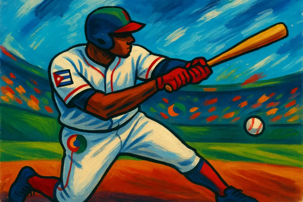
6. Cuba: A Cultural Honors
Cuba’s jerseys display an engaging design that gives a nod to the nation through creative script placement and accents that complement the stylization. Highlighting both tradition and contemporary design, they find themselves amid the more stylish uniforms seen.
5. Dominican Republic: A Touch of Glamour
The Dominican Republic jerseys achieve a perfect blend of style and cultural representation. With notable players enhancing the overall appeal, the vibrant design stands out beautifully against the competition.
4. Korea: Retro and Engaging
South Korea’s jerseys grab attention with bold designs that give off nostalgic vibes reminiscent of the early NBA era. This engaging approach translates into a unique representation amid the collection.
3. Venezuela: Striking Aesthetic Appeal
Venezuela’s color combination offers a vivid burst of energy, making them a standout choice among the evaluated teams. The script’s clever overlay counters the simplicity some teams struggle with, resulting in an inviting and engaging uniform.
2. Samurai Japan: Traditional Excellence
Japan is represented well with a classic and timeless jersey that embodies both tradition and athletic excellence. With Mizuno producing these uniforms, they convey respect and innovation effectively, allowing Japan to capture the essence of their baseball heritage.
Conclusion: A Diverse Display of National Identity
In conclusion, the upcoming World Baseball Classic will undoubtedly be a visual spectacle, showcasing jerseys that represent each nation’s individuality and pride. Although the rankings may spark debate, one thing is clear: the joy of representing one's country through sport is as powerful as ever, and fans will eagerly support their teams in style.