
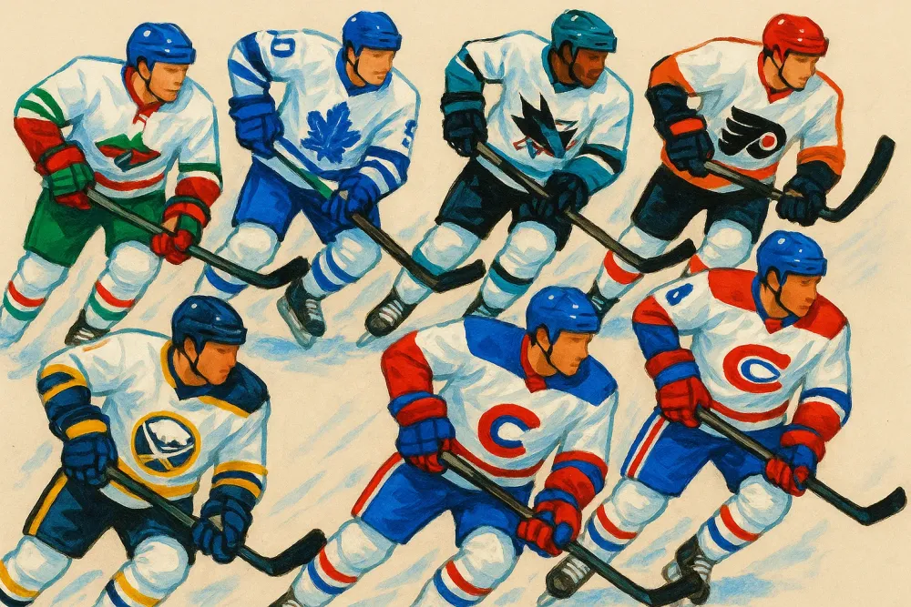
The NHL is constantly evolving, and with each new season comes fresh takes on team jerseys that evoke passion from fans. Recently, after evaluating the home jerseys, a thorough assessment of the road jerseys was due. Although many teams have stuck with their existing designs since last season, the nuances—particularly the incorporation of sponsor logos—bring varying degrees of excitement and aesthetic appeal. Cleaning out preconceptions regarding 'plain' white road jerseys is essential as they often allow more vibrant colors to shine through, making striping and logos appear more dynamic on the ice.
White Jerseys: Love Them or Hate Them?
For many hockey enthusiasts, road white jerseys may seem unremarkable and dull due to their minimalist approach. However, this perception is misleading. The clean white canvas provides an excellent backdrop for creative elements, allowing team colors and logos to breathe. As fans, we yearn for the day when teams can don white jerseys at home again, giving fans the opportunity to appreciate visiting teams’ unique color schemes instead of relying on a consistent sight night after night.
Ranking the Road Jerseys: 1 to 32
When it comes down to the road jerseys from all 32 teams in the NHL, it's important to clarify that there are no outright 'bad' designs. However, rankings reveal that while some jerseys excel, others leave room for improvement.
The Bottom Tier
Starting with the teams that have struggled with their road whites, the Washington Capitals stand out. Their design, marred by the chaotic Reebok redesign from the 2000s, suffers from excessive piping and misplaced colors. While their fonts for numbers and lettering are impressive, the overall look feels cluttered, overshadowing their attractive crest logos.
Next up is the Florida Panthers. Their away jerseys, although unique, rank just above last place due to overwhelming patchwork designs and shoulder number placements that evoke more of a football rather than a hockey vibe.
The Minnesota Wild's road jersey appears clean but ultimately lacks the pop that fans desire. Despite featuring double stripes at the waist, the excess white diminishes the overall color impact—something to be cautious of when designing jerseys.
Progressive Looks That Impress
Conversely, assessing the jerseys that balance style and branding well is essential. The Tampa Bay Lightning's road whites exemplify simplicity without sacrificing aesthetic value—blue logos and lettering on a white canvas pops and invokes a sense of sharpness.
Following closely is the Seattle Kraken, whose understated away jersey pays homage to the team’s marine essence. Featuring bold colors of blue and red stripes reflective of Seattle's coastal identity, the Kraken manage a fresh yet traditional look.
Meanwhile, the Ottawa Senators honor their storied history with their road whites, donning colors that evoke nostalgia while placing original logos prominently. The red and black stripes offer a robust, visually appealing design bound to capture any hockey fan's heart.
Classic Styles and New Innovations
Historical designs continue to make a notable resurgence; the Montreal Canadiens' road jerseys, virtually unchanged since 1947, embody timeless elegance and tradition. Their powerful logo against a stark white base represents the cultural heritage of hockey in Canada.
On the brighter side historically, the Los Angeles Kings have expertly blended nostalgia with modernity, reverting to their iconic 1990s attire. The lavish use of silver and black captures attention on the ice, melding history and current trends beautifully.
Additionally, a shout-out to the Chicago Blackhawks can't be overlooked; their road design remains one of the most recognizable in sports, with clean lines and heritage-focused themes contributing to their overall success.
Standout Performers
Stealing the show at the top of the ranking is the Edmonton Oilers. Their white jerseys embody a fierce spirit, proudly displaying the iconic blue and orange color palette synonymous with an era of greatness. Worn by hockey legends like Wayne Gretzky, their design is not only beautiful but historically significant, evoking feelings of pride among fans.
Close contenders are the Buffalo Sabres and the Toronto Maple Leafs. The Sabres' road whites combine an elegant modernized look while retaining nostalgic shades of blue and gold, perfectly representative of their franchise history. The Leafs' simple yet iconic style has remained relevant for nearly a century, demonstrating that sometimes, less is indeed more.
Final Thoughts
As we assessed the numerous designs present among the NHL teams, it's clear the variance in styles impacts fan sentiments deeply. The road jerseys may sometimes be understated, but they offer teams an opportunity to represent their identity on a larger stage. Outclassing other uniforms requires creativity, historical respect, and an understanding of contemporary aesthetics, and it’s delightful to see many teams aspiring toward excellence.
As the season continues and teams battle for supremacy, we look forward to seeing how these jerseys will resonate with fans and dynamics on the ice. For now, we can appreciate the enduring form and function of these road whites and cheer on our favorite teams as they don them.